After more than a decade, we felt it was time our identity caught up with the salon it represents. So we refreshed it — carefully, and in good company.
The new branding was designed by Studio Libro, who understood from the first conversation what we were after: something restrained, confident and unmistakably ours. Nothing loud, nothing of-the-moment — a look built to age as well as our colour does.
The result is a design language shaped by movement and structure. The palette — olive, chartreuse and cream — is a modern interpretation of nature’s own, and the forms draw from coloured layers, building depth the way a well-placed colour does. Look a little closer and the design elements themselves are drawn from haircuts: the lines and shapes of the work we do, turned into an aesthetic that’s entirely our own. It’s branding that comes from the craft rather than sitting on top of it.
We’ve also built in room to breathe. Like the salon itself, the identity isn’t fixed — the colours may evolve and shift with the seasons, so the brand stays alive rather than frozen in a single moment. Always looking, evolving and refining: the same instinct we bring to everything else.
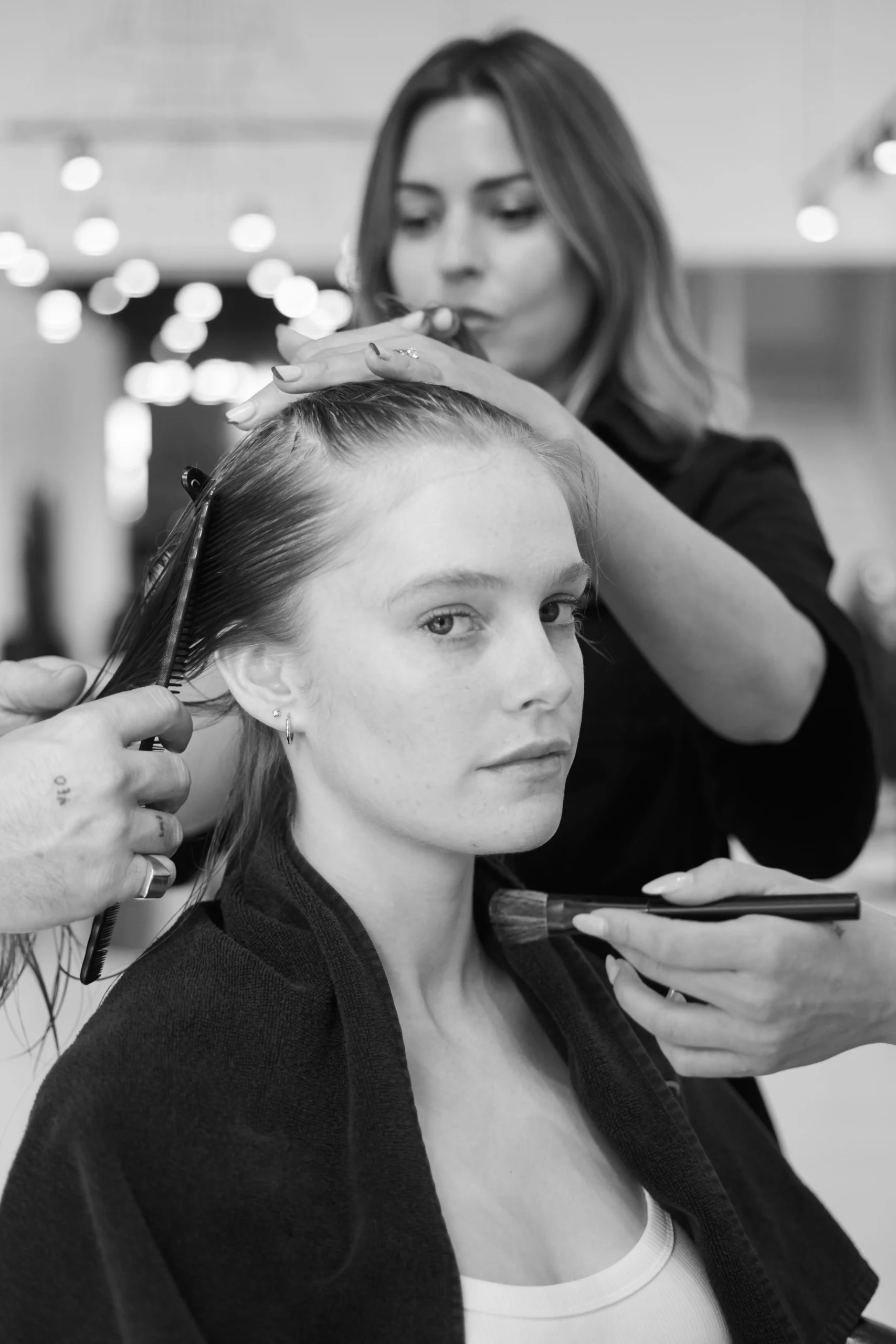
The photography is by Adrian Mesko, whose eye brought the rooms, the light and the team to life exactly as they feel in person. Good imagery is the difference between a website that describes a salon and one that lets you feel it before you’ve walked in — and that’s precisely what these images do.
The brief, throughout, was the same one we bring to a head of hair: take something with real foundations and refine it, rather than reinvent it for the sake of change. The result is cleaner, calmer and more considered — and, we think, far more us.
You’ll see it roll out across everything from here — the website, the salon, and the small details in between. We’re proud of it, and grateful to the people who helped us get there.